Events / Brand System

GR

Rebrand for Grupo GR, a Canarian operator with over eight years in the events industry. A visual system that articulates its different business units under a single logic, while preserving each unit's own identity.

01

The context

Grupo GR had been operating in the Canarian events industry for over eight years through several specialised business units. Each unit ran autonomously with its own communication: effective in the short term but invisible as a group. There was no system articulating the brands under a common logic, and that capped the perception of scale the group already had operationally.
02

The concept

The rebrand wasn't aesthetic, it was structural. The guiding idea was to build a shared visual architecture that unified without flattening: each unit keeps its character, but all speak from the same system. The group brand stops being an administrative umbrella and becomes presence.

03

The solution

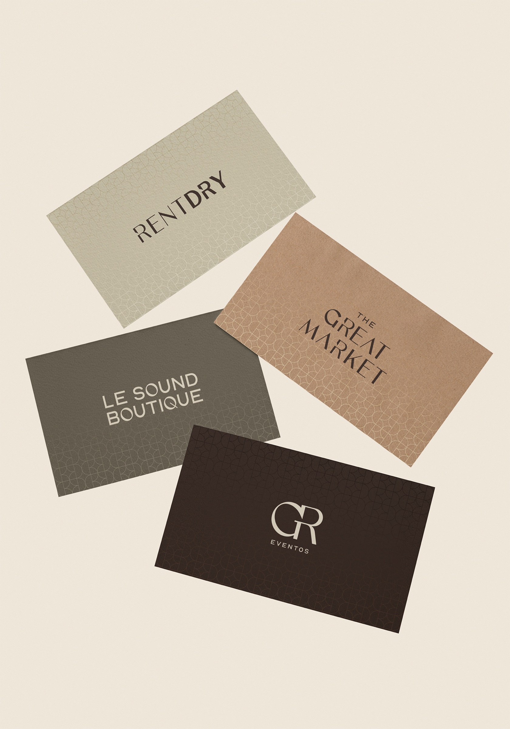
A modular system with geometric patterns shared across all units. The visual architecture defines what stays constant —language, grid, base typography— and what varies per unit —colour, rhythm, accent—. The result is a group legible as a whole without sacrificing each sub-brand's specialisation.

04

Application

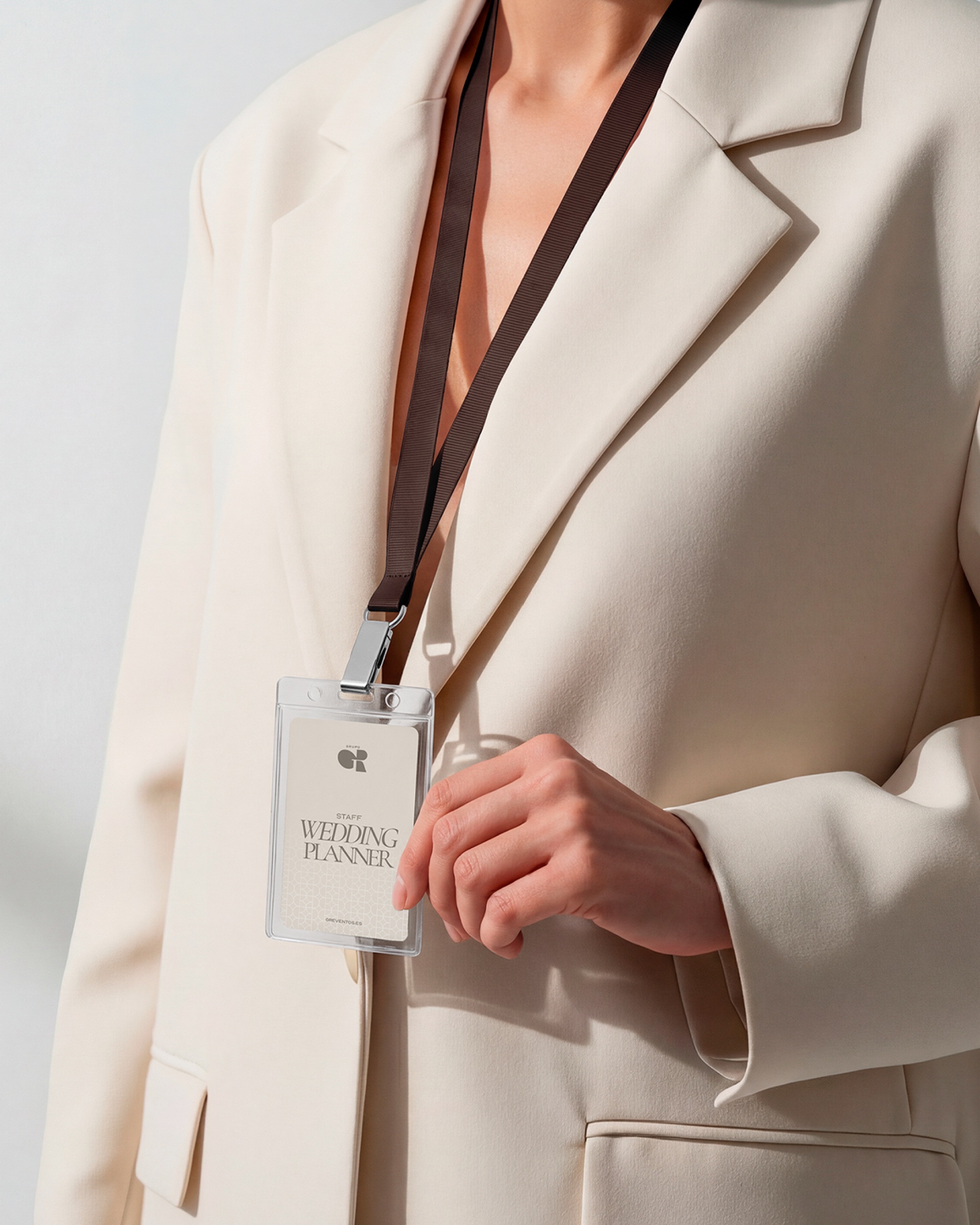
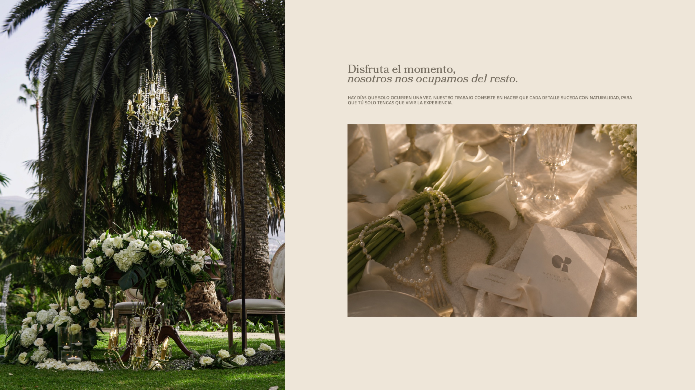
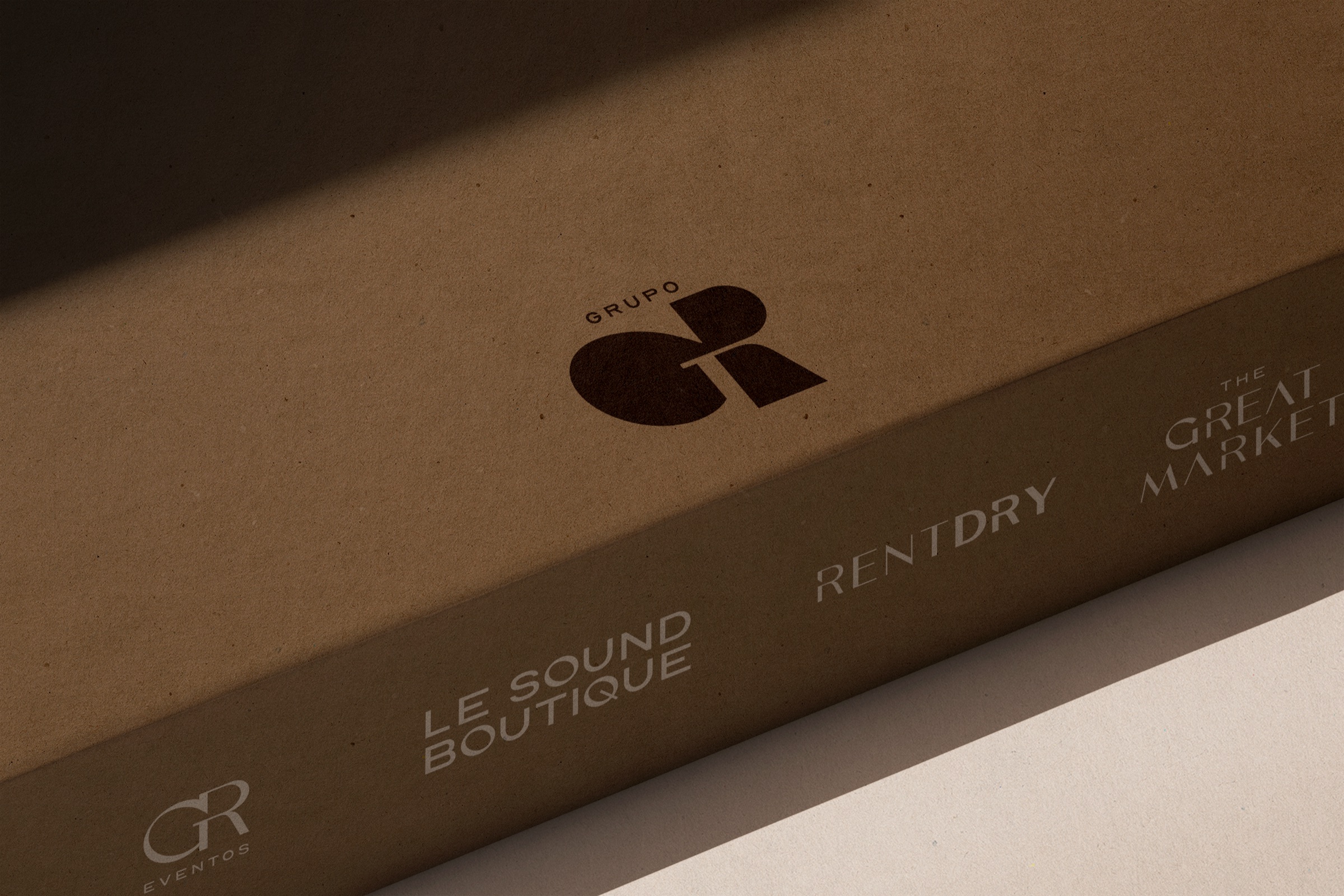
The system rolls out across motion (loops as a live brand resource), corporate stationery, cards, team IDs, packaging and digital presence. Every touchpoint reinforces both the individual unit and the group belonging.

More projects

let's make something

Got a fun idea?

Let's talk